High COE Prices - Are PHVs the Real Culprit?
Background
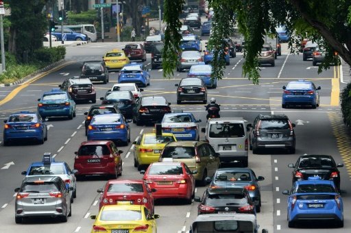
It is widely recognised that car ownership in Singapore is exceptionally expensive. A significant portion of this cost stems from the Certificate of Entitlement (COE), which serves as a permit for car ownership. The availability of COEs is determined by a quota that varies monthly. Prospective car owners must bid for a COE with the number available capped by the quota for each bidding period. In certain instances, intense competition during bidding has led to substantial increases in COE prices, thereby significantly inflating the overall cost of car ownership.
COE prices have remained elevated since the post-pandemic period, with private hire vehicles (PHVs) often blamed for contributing to these increases. This claim appears credible. Historically, private vehicles were seldom used for commercial purposes until the emergence of ride-hailing apps. Additionally, the severe economic impact of the pandemic led many individuals to seek income through the gig economy. The rise in ride-hailing drivers has consequently led to allegations that PHV owners and companies have engaged in aggressive bidding for COEs, and were responsible for driving up COE prices. Recent headlines, such as “Private-hire companies deny bidding aggressively for COEs and pushing premiums up” and “Car leasing firms that bid for private hire vehicles are often blamed whenever COE prices go up. But are they the drivers of high premiums?”, reflect the ongoing debate surrounding this issue.
Therefore, we shall investigate if there is evidence to support the claim that high COE prices are driven by demand for PHVs or is there more that meets the eye. R Studio shall be the main programming language used to support the creation of this op-ed (i.e. import, explore, wrangle and visualize) and the dataset is referenced from Data.gov.sg.
1.0 Introduction
Are Private Hire Vehicle (PHV) to blame for rising COE prices? It has become a trending debate on everyone’s lips. While some had associated the growing number of PHVs as a key determinant, others suggested that broader economic factors and policy interventions are at play. Therefore, this op-ed seeks to unpack both ends of the debate supported by data visualisations and reputable sources. To set the flow, an overview to the evolution of Singapore’s vehicle ownership policy will first be presented to provide context, followed by a comprehensive analysis. My insights and suggestions shall be presented at the end of this op-ed as a closure to this debate.
1.1 Evolution of Singapore’s Vehicle Ownership Policy
Singapore is an island republic with an estimated land area of 735.6 square kilometres (KM2) and is ranked as the world’s third most densely populated country in 2024, with an average population density of 8,123/KM2 (Countries by population density: Countries by density 2024). As a land-scarce country, managing vehicle population while alleviating urban traffic congestion have been key priorities since Singapore’s independence. In her formative years, Singapore adopted a fiscal restraints approach to regulate vehicle population where various taxes were introduced. These included import duties, a lump sum registration fee, an Additional Registration Fee (ARF), as well as annual road taxes based on vehicle capacity.
As ARF grew exponentially in the mid-1970s, the government introduced the Preferential Additional Registration Fee (PARF) scheme as a pre-emptive measure to deter existing owners from opting against replacing their cars as prevailing market conditions were unfavourable towards car replacement. PARF offers an attractive rebate when owners opt to scrap their vehicle within ten years from registering a new car with the goal of incentivising car replacement while reducing the average age of cars on public roads.
Although PARF was successful in reducing the average age of cars, it was not without its flaws. Rising ARFs, coupled with an appreciation to foreign currencies (e.g. Japanese Yen), as well as the lack of proportional adjustments to PARF rates throughout 1980s resulted in an inflated scrap car prices and unintended profits. In other words, vehicle owners were incentivised to purchase cheaper made cars for resale at higher scrap values instead. Despite government intervention through additional taxes on car consumption (e.g. petrol tax, road tax), doubling of car park fees in public housing estates as well as extending time restrictions during peak hours to the usage of popular roads (e.g. in the Central Business District), car ownership in Singapore continued to rise, highlighting distortions in existing policy.
Following public dissatisfaction and outcries for change, an internal review was conducted, and the Vehicle Quota Scheme (VQS) was implemented in May 1990 with the intention to effectively control vehicle population growth. A major component of VQS was the competitive bidding process to obtain the Certificate of Entitlement (COE), which grants the right to own a vehicle for ten years. This process promoted equality and served as an efficient method of allocating resources across different vehicle categories. VQS also allowed the government to exercise greater control over vehicle population through forecasted growth rates and encouraged a shift towards higher-quality imports. This shift in preference optimised the use of scarce resources and improved overall quality of vehicle on public roads.
Over the years, several refinements have been made to improve VQS, including enhanced transparency to bidding process, revised off-peak car scheme, implementation of a zero-growth policy as well as a streamlined vehicle category for tenders depicted in Table 1.
Table 1: Classifications of Vehicle Categories 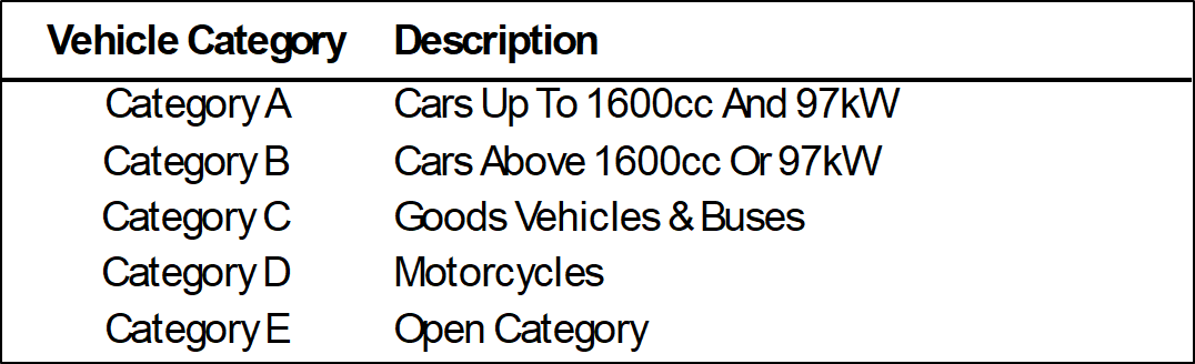
2.0 Data Analysis
The following sections shall explore potential factors that may influence COE premium in Singapore, followed by whether PHVs are to blame for the recent rise in COE premium. Therefore, the discussions will mainly revolve around “Car Categories” (i.e. Category A, Category B and Category E). Refer to Data Appendix for detailed discussions on data pre-processing and plotting.
2.1 COE Premium Over the Years
We begin the discussion by visualising price fluctuations to COE premium over the years depicted in Figure 1 below.
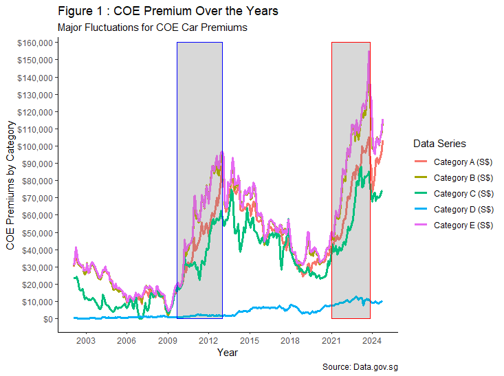
It is observed that COE premium has underwent several cycles of ebb and flow throughout the years, with all car categories experiencing the most fluctuations. During the same period, there were also two bullish rallies following significant events, with the former being post global financial crisis (i.e. grey highlights with blue frame), and the latter being post COVID-19 pandemic (i.e. grey highlights with red frame).
However, the presence of both significant events alone does not provide sufficient evidence to draw conclusions as the main factors driving such influence. Therefore, the design of COE premium and wider economic factors shall be investigated further.
2.2 Supply and Demand for Vehicles in Singapore
As a land-scarce nation, the supply of vehicles on public roads are policy driven where it is Government mandated and administered through VQS. Under VQS, the annual supply of vehicle (quota) is determined based on a rolling average of total deregistered vehicles over the previous four quarters allocated to its respective categories. In other words, batches of vehicles that were due for deregistering in a set year directly affects subsequent fluctuations in supply between January 2002 and January 2018.
To top it off, initial vehicle growth-rate policy was set at 3% per annum. However, from February 2018, the Ministry of Transport announced that the vehicle growth-rate shall be zero for all categories except Category C at 0.25% in tandem with Singapore’s car-lite policy which aims to shift perception from car ownership to increased use of public transportation. Since the announcement, a downward trend in vehicle supply can be observed, barring periods between April 2020 and June 2020 in view of an elevated safe distancing measure where no open biddings were held to prevent the spread of COVID-19.
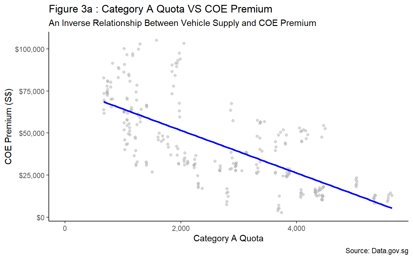
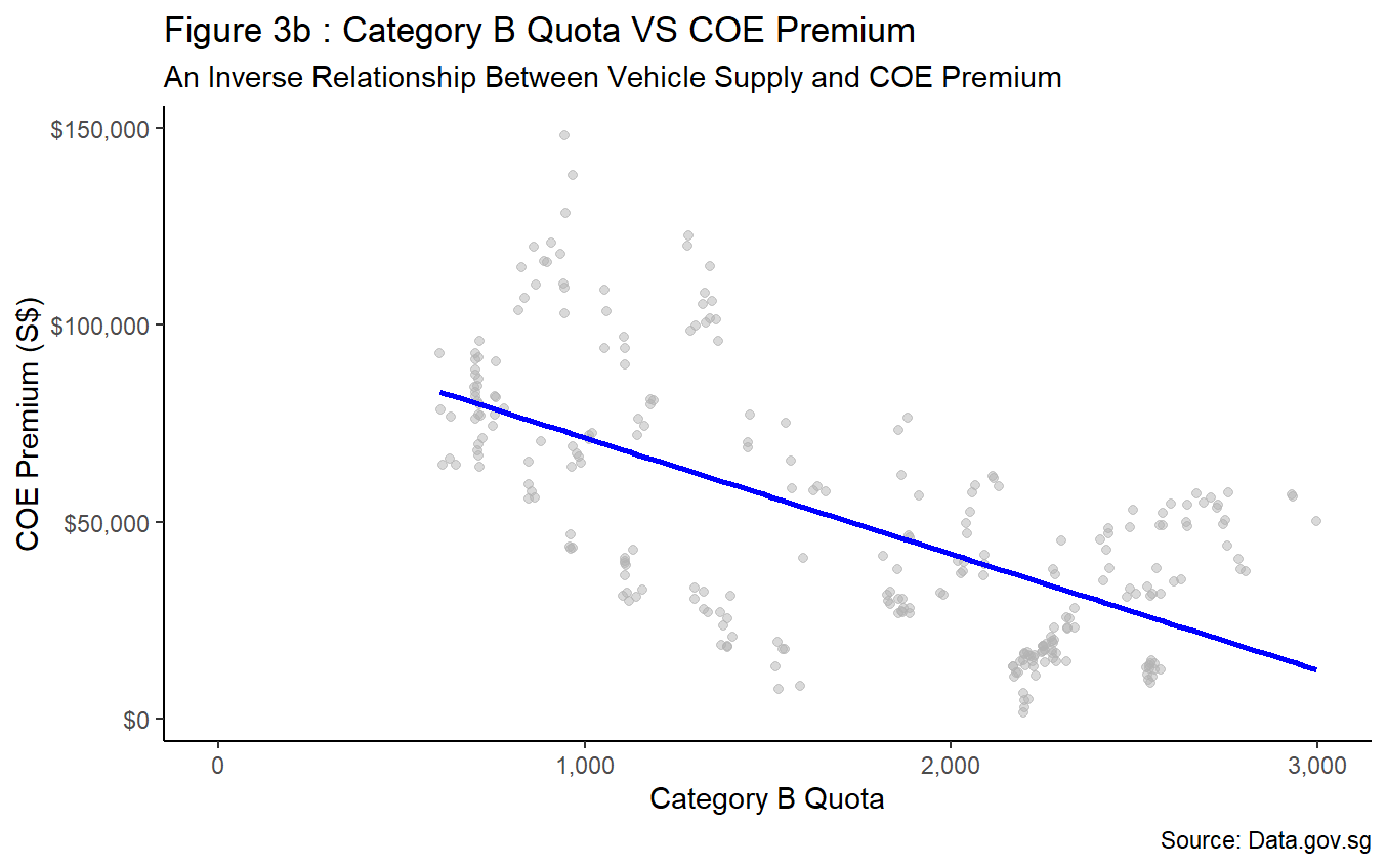
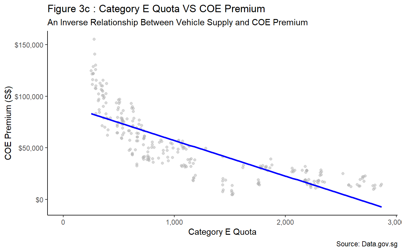
Figure 3a to Figure 3c depicts similar negative correlations between COE premium and vehicle quota for all three car categories. Therefore, it is conclusive that fluctuations to COE premium can be influenced by the amount supply made available by the Government. This trend is supported by the Government’s announcement to adopt a cut-and-fill approach in bringing forward additional quota to ease demand for Category A and Category B vehicles while retaining its zero-growth policy. As a result, a 35% increase in supply relative to previous quarter is observed, followed by a corresponding sharp decline in COE premium. The abovementioned policy changes and trend observations further highlight the policy driven nature of vehicle supply in Singapore.
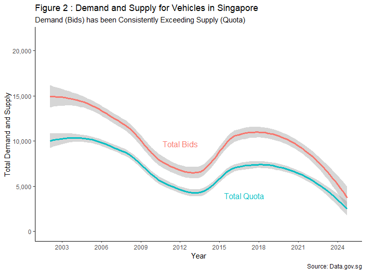
Another prominent feature of VQS was the introduction of a bi-monthly open bidding exercise to effectively allocate resources via a COE, forming the demand (bid). Comparing the behaviour of bids relative to quota in Figure 2, it suggests that demand for vehicle mirrors the fluctuation of supply at any given time. In addition, demand for vehicles also consistently exceeds the supply of vehicles throughout the chart. This shows that policy changes can shape consumer’s decision thus affecting overall demand. Nevertheless, we shall delve into the economic conditions of Singapore, as well as consumer’s individual wealth across time to determine if such factors also contribute to vehicle demand.
2.3 Economic Conditions and Individual Wealth
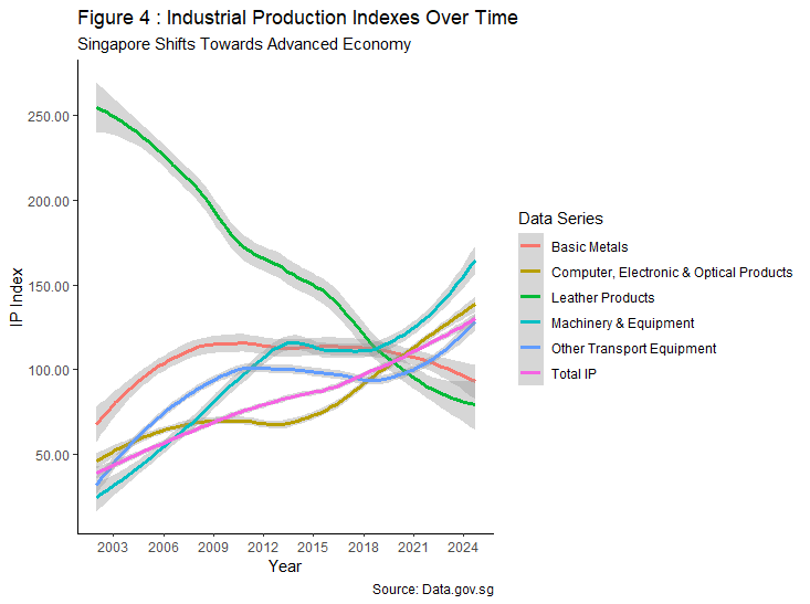
With reference to Figure 4, a fall in production to commodity items such as basic metals and leather products are observed. On the contrary, Singapore has seen a ramp up in production for higher technological areas such as machinery, equipment and IT-related products. In addition, production for transportation equipment also rose, complementing the Government’s initiative to go car-lite through expanding its current public transport infrastructure.
On a granular level, Singapore has achieved economic diversification, opting for manufacturing value-add towards advanced technologies over commodities. This shift in production preference indicates Singapore’s vision in attaining sustainable economic growth and higher productivity in the long term. It is further supported by the “Total IP” index, where overall production has been increasing steadily despite experiencing two significant events such (i.e. global financial crisis and COVID-19 pandemic), signalling strong economic growth.
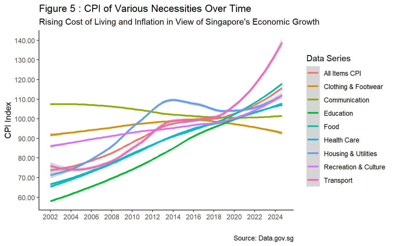
Singapore’s rapid economic growth is not without its consequences. Looking at CPI indexes in Figure 5, most necessities have risen over the years, barring communication and clothing. Among the necessities, transport index has recorded the most significant uptick, especially post COVID-19 pandemic. The overall increase to CPI index, as denoted by “All Items CPI”, also proves that general cost of living in Singapore has elevated in view of its rapid economic growth.
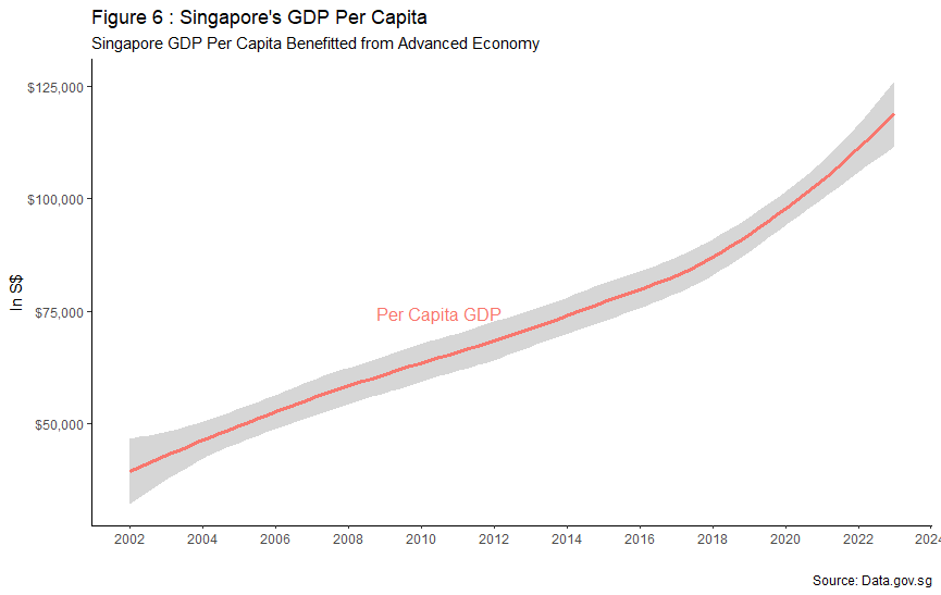
However, Singapore’s Gross Domestic Product (GDP) per capita has benefitted from its shift towards an advanced economy through embracing manufacturing value-added output. Between 2002 and 2024, Singaporean’s GDP per capita has amassed an astounding growth rate of 187%. As of 2023, Singapore is ranked fifth in GDP per capita, pulling its weight among other economic powerhouses such as The United States, Germany and Qatar, further showcasing Singaporeans growing purchasing power. As a result, Singaporeans income growth can keep pace with rising cost of living for various necessities depicted within CPI chart in Figure 6.
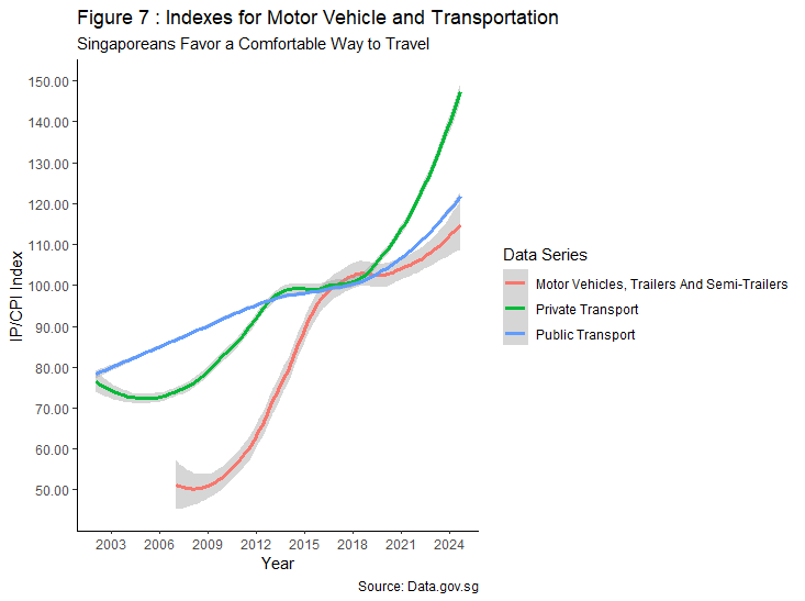
It is important to note that growing affluence also sparked a shift towards lifestyle choices, leading to improved quality of life. This is evident in Figure 7, where production of motor vehicles and price indexes for both transportation modes have increased in tandem with rising GDP per capita in Figure 6. Despite the Government’s efforts in promoting a car-lite society and zero-growth policy, growth in price index for private transportation outpaced public transportation post COVID-19 pandemic. This indicates Singaporean’s preference in prioritising comfort over practicality should their financial situation permit, which are factors that drive overall demand for cars.
2.4 Catalysts for Demand – Low Interest Rates and Car Dealership Intervention
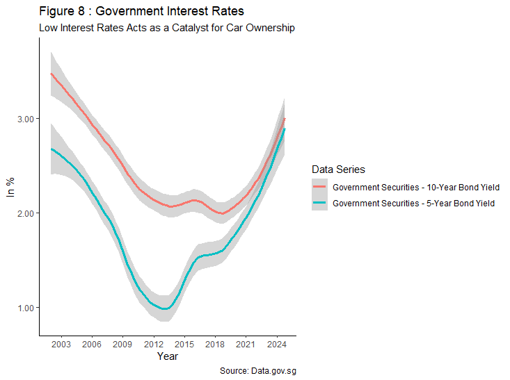
The maximum loan tenure for the purchase of vehicle is capped at seven years with effect from 27 May 2016, regulated by the Monetary Authority of Singapore (MAS). Therefore, the five- and ten-year bond yields shown in Figure 8 are used as proxies to visualise fluctuating interest rates for car loans offered in the market.
Over the years, Singapore’s interest rate remains one of the lowest when compared to its counterparts as MAS’ monetary policy focuses on exchange rate than domestic interest rates to combat inflation. The consistent low interest rate, coupled with long loan duration may have served as a catalyst for aspiring car owners to participate in the COE bidding process while leveraging on debt, spurring the high demand observed in Figure 2 above.
In addition, over 90% of vehicles are transacted through authorised dealerships, which holds an exclusive licence with the main manufacturer to distribute vehicles of a given brand. To provide an all-round package and convenience to consumers, most car dealers offer various COE packages, with the prominent one being “Guaranteed COE”. Under the guaranteed COE package, car dealers will make bids on behalf of consumers that are often higher than current market rate to secure a certificate fast.
As consumers became receptive over the comfort and mechanics of such packages offered, coupled with the oligopolistic nature of car dealerships, their influence over COE premium results may have expanded over time, serving as additional catalyst to spur demand.
2.5 Growth of PHVs and its Impact on COE Premium
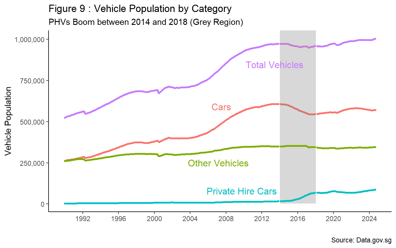
Apart from economic conditions and individuals growing affluence, some have associated the recent rise of COE premiums with the emergence of PHVs. Looking at Figure 9, there seems to be certain degrees of relation. Between 1 January 2014 and 1 February 2018 (right before zero-growth policy), there was a boom in PHV population with an approximate growth rate of 309% observed, directly contrasting with a negative growth rate of 11% for the cars population.
In addition, COE premium for all car categories fell during the same period (refer to Figure 1). Focusing the lens post COVID-19 pandemic, the sluggish growth rate of private hire cars does not seem to influence COE premium. Rather, fluctuations to recent COE premium can be associated with Government’s zero-growth policy as supply is artificially restricted, coupled with a cut-and-fill approach to vehicle supply in Q4 2023, resulting in a decline to COE premium in the following quarter.
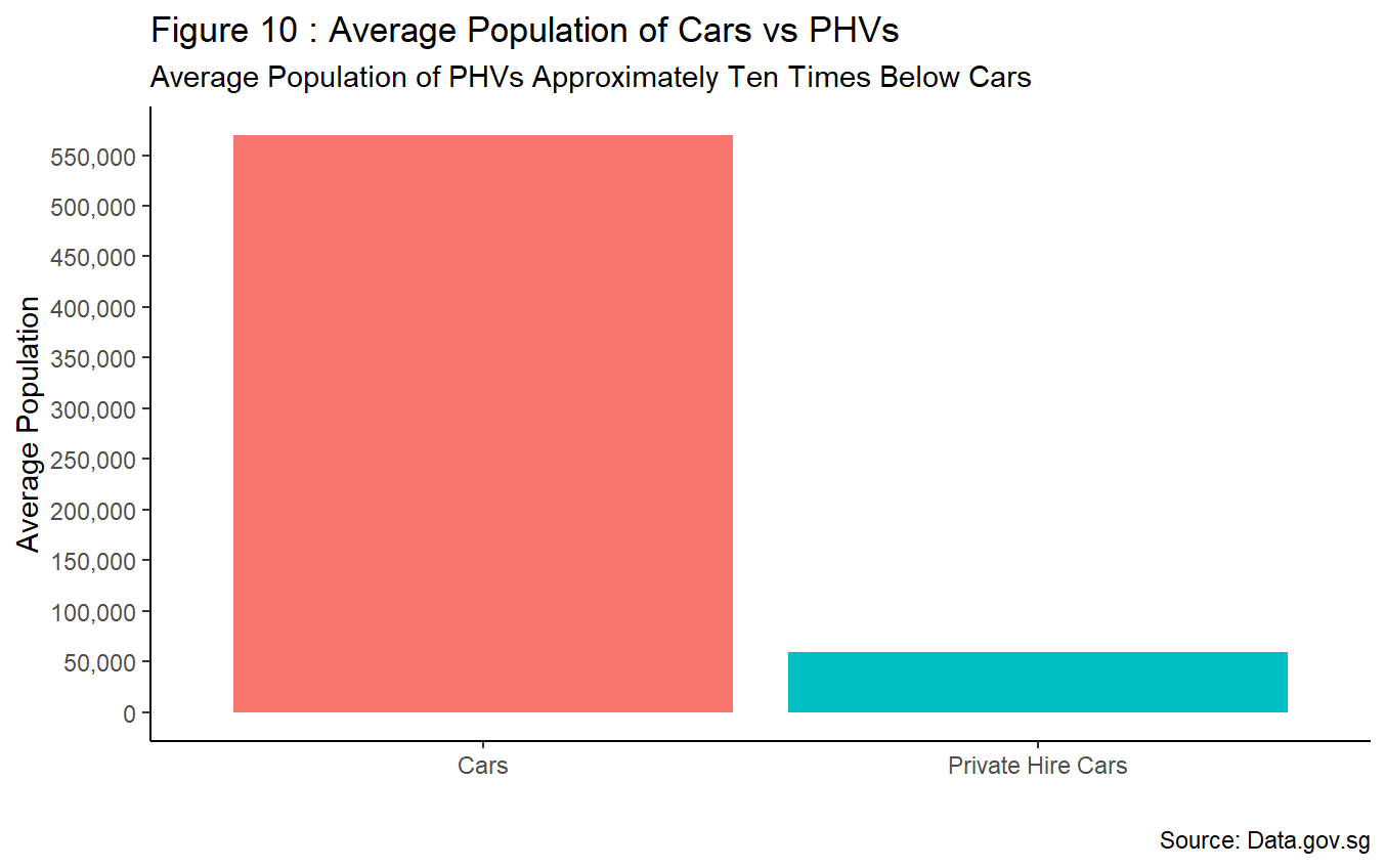
Visualising vehicle population in terms of its average numbers paints a similar narrative. From Figure 10, it is observed that average population of private hire cars (i.e. ~59,420) is approximately ten times lesser than cars (i.e. ~569,224) post emergence of PHVs between January 2014 and October 2024. Therefore, it is unjust to pass the blame of rising COE premiums onto PHVs entirely.
3.0 Final Thoughts
All arguments considered, I strongly believe that the emergence of PHVs alone is not the determining factor for rising COE premium, but rather, a convenient scapegoat to conclude this debate. Evidence presented within this op-ed suggests that natural market forces of supply and demand are at play. The supply side is largely policy driven (e.g. Singapore’s car-lite policy, MOT’s zero-growth policy and cut-and-fill approach) with artificial sacristy brought onto vehicles being observed. On the other hand, demand is largely influenced by Singapore’s overall economic growth, complemented by Singaporean’s growing affluence and quality of life through rising GDP per capita where comfort is prioritised over practicality when financials allow. These factors, along with low borrowing rates, ultimately fuels growing demand for vehicles and creates opportunities for car dealership to exercise their influence over results of COE premium.
While some had argued that growth in demand for vehicles and COE premium is driven by foreigners, the proportion of bids won by foreigners remained low at approximately 2% as of October 2023.
Looking at the granular picture, one might agree that the rising COE premium simulates a cyclic succession pattern. This pattern begins with an increase in GDP per capita, which boosts consumer purchasing power and, consequently, the CPI. As a result, there is a higher likelihood of individuals wanting to own a car for convenience. They then approach car dealerships, which assist them in submitting bids to increase their chances of obtaining a COE. The oligopolistic nature of the car dealership industry in Singapore gives them control over bidding prices. This, combined with the government’s car-lite and zero-growth policy, leads to rising COE premium as demand consistently exceeds supply.
To break off from such pattern, some have suggested the creation of another bidding category reserved for PHVs only. However, I am of view that it may not be effective in stabilising COE premiums as total vehicle quota remains the same regardless. In addition, this suggestion may further saturate distribution to an already scarce resource, potentially driving up premiums further through the influence and control of car dealerships by their participation in the bidding process.
As the government is administering a shift to vehicle supply forward to ease rising COE premium, perhaps a more progressive step that compliments the implementation is to:
Bar car dealerships from making bids on behalf of consumers; and
Only allow first time vehicle-owners-to-be and existing owners whose COE are expiring (e.g. less than two years) to participate in the bidding process.
This pairing suggestion aims to discourage car dealerships from exercising greater control and influence over COE results while levelling the playing field for genuine buyers, ultimately stabilising COE premiums in the long run.
Data Appendix
Note: The ‘View()’ function is written into the console as part of sanity check process throughout the Data Appendix instead of embedding into R Script. Thus, the ‘View()’ function shall not be discussed below.
The coding within R script begins by setting working directory using ‘setwd()’ function.
1
2
3
# Set working directory in R

setwd("C:/Users/keith/OneDrive - SUSS University/Modules/Y1S1 - ANL501/1. TMA/ANL501_TMA01_N2510329_Liew_Kai_Kiat")
Loaded the ‘readxl’ package using ‘library()’ function:
- The ‘read_excel’ function was used to read TMA Excel file;
- Data object was assigned to all five data frames for ease of identification.
1
2
3
4
5
6
7
8
9
10
11
12
13
14
15
16
17
18
# Import TMA dataset into R

library(readxl) # load 'readxl' package

COE_data <- read_excel("ANL501_JAN25_TMA_data.xlsx",
                       sheet = "COE")

CARS_data <- read_excel("ANL501_JAN25_TMA_data.xlsx",
                        sheet = "CARS")

IP_data <- read_excel("ANL501_JAN25_TMA_data.xlsx",
                      sheet = "INDUSTRIAL_PRODUCTION")

CPI_data <- read_excel("ANL501_JAN25_TMA_data.xlsx",
                       sheet = "CPI")

INTEREST_data <- read_excel("ANL501_JAN25_TMA_data.xlsx",
                            sheet = "INTEREST")
Exploring data frames
- Loaded ‘tidyverse’ package using ‘library()’ function;
- Used ‘glimpse()’ function to have an overview visuals of the data structure.
1
2
3
4
5
6
7
8
9
# Explore all data frames

library(tidyverse) # load 'tidyverse' package

glimpse(COE_data) # 2020 Apr to Jun are denoted with "chr", to change to "num"
glimpse(CARS_data) # Observations are in "chr" class, to change to "num"
glimpse(IP_data) # Observations are in "chr" class, to change to "num"
glimpse(CPI_data) # Observations are in "chr" class, to change to "num"
glimpse(INTEREST_data) # Observations are in "chr" class, to change to "num"
Cleaning data frames
- Used the ‘mutate()’, ‘across()’ and ‘as.numeric’ functions to change all observations from “chr” to “num” class barring first column with ‘-1’ argument for consistency;
- For IP, CPI and INTEREST datasets, noted there were inconsistent decimal points presented. Thus, the expression ‘mutate(across(-1, ~ ifelse(is.na(.), NA, round(., 2))))’ was used to round all observations to two decimal places (i.e. 2 d.p) for data consistency barring first column with ‘-1’ argument. In addition, ‘~’ was included to create an anonymous function, coupled with ‘.’ that denotes all columns to be processed. The ‘if.na’ expression is used to preserve all “NA” values to maintain data completeness;
- Did a check by using ‘str()’ function to ensure cleaning was applied correctly to all observations;
- Note: “NA” values are not removed at this juncture to ensure completeness of the cleaned data for subsequent wrangling/plotting.
1
2
3
4
5
6
7
8
9
10
11
12
13
14
15
16
17
18
19
20
21
22
23
24
25
26
27
# Cleaning data frames (Converting from "chr" to "num" class for data consistency.)

COE_data <- COE_data %>%
  mutate(across(-1, as.numeric)) # applying "mutate" and "across" functions to change all values to "num" barring first column with "-1".
str(COE_data)

CARS_data <- CARS_data %>%
  mutate(across(-1, as.numeric))
str(CARS_data)

IP_data <- IP_data %>%
  mutate(across(-1, as.numeric))
IP_data <- IP_data %>%
  mutate(across(-1, ~ ifelse(is.na(.), NA, round(., 2))))
str(IP_data)

CPI_data <- CPI_data %>%
  mutate(across(-1, as.numeric))
CPI_data <- CPI_data %>%
  mutate(across(-1, ~ ifelse(is.na(.), NA, round(., 2))))
str(CPI_data)

INTEREST_data <- INTEREST_data %>%
  mutate(across(-1, as.numeric))
INTEREST_data <- INTEREST_data %>%
  mutate(across(-1, ~ ifelse(is.na(.), NA, round(., 2))))
str(INTEREST_data)
Pivoting data frames
- The ‘pivot_longer()’ and ‘pivot_wider()’ functions were used to convert columns into rows and vice versa whole retaining the same object naming across all data frames for ease of identification;
- The “Period” name was added after applying ‘pivot_longer()’ to denote date observations within.
1
2
3
4
5
6
7
8
9
10
11
12
13
14
15
16
# Pivoting data frames

COE_data <- pivot_longer(data = COE_data, cols = 2:274, names_to = "Period")
COE_data <- pivot_wider(data = COE_data, names_from = 'Data Series', values_from = value)

CARS_data <- pivot_longer(data = CARS_data, cols = 2:755, names_to = "Period")
CARS_data <- pivot_wider(data = CARS_data, names_from = 'Data Series', values_from = value)

IP_data <- pivot_longer(data = IP_data, cols = 2:502, names_to = "Period")
IP_data <- pivot_wider(data = IP_data, names_from = 'Data Series', values_from = value)

CPI_data <- pivot_longer(data = CPI_data, cols = 2:766, names_to = "Period")
CPI_data <- pivot_wider(data = CPI_data, names_from = 'Data Series', values_from = value)

INTEREST_data <- pivot_longer(data = INTEREST_data, cols = 2:443, names_to = "Period")
INTEREST_data <- pivot_wider(data = INTEREST_data, names_from = 'Data Series', values_from = value)
Convert “Period” column into “Date” format
- Loaded ‘lubridate’ package using ‘library()’ function;
- Used the ‘as.Date()’ function to convert “chr” into “date” class. As the string only provides the year and month (i.e. YYYY MMM) format, the function ‘paste0()’ was passed to help append the string “01” before a smooth conversion into “date” class can be done;
- The format of the date format is “%Y %b %d” (i.e. YYYY MM DD).
1
2
3
4
5
6
7
8
9
10
11
12
13
14
15
16
17
18
# Convert “Period” column into “Date” format

library(lubridate) # load 'lubridate' package

COE_data <- COE_data %>%
  mutate(Period = as.Date(paste0(Period, "01"), format = "%Y %b %d"))

CARS_data <- CARS_data %>%
  mutate(Period = as.Date(paste0(Period, "01"), format = "%Y %b %d"))

IP_data <- IP_data %>%
  mutate(Period = as.Date(paste0(Period, "01"), format = "%Y %b %d"))

CPI_data <- CPI_data %>%
  mutate(Period = as.Date(paste0(Period, "01"), format = "%Y %b %d"))

INTEREST_data <- INTEREST_data %>%
  mutate(Period = as.Date(paste0(Period, "01"), format = "%Y %b %d"))
Data manipulation in data frames
- Loaded ‘dplyr’ package using ‘library()’ function;
- For COE_data – ‘mutate()’ function was used to create new columns to combine total “Quota”, “Bids” and “Successful Bids” as there are two open biddings that makes up total supply/demand in a given month. The ‘rowSums()’ function was passed to sum up observations from two open bidding process for an accurate analysis/plotting subsequently. The ‘na.rm = TRUE’ was also included as an additional argument to ignore “NA” observations when performing a sum between two defined observations. New columns were added with the suffix “Quota”, “Bids”, “Successful Bids” by their respective categories. It is also important to note that the ‘rowMeans()’ function was used to compute COE premium instead of ‘rowSums()’ as that variable is presented in “dollar” format and summing it will result in an inflated COE premium in the subsequent analysis/plotting;
- For CARS_data – Noted there was a duplicate value based on the earlier data structure check through ‘glimpse()’. Thus, “NA” was assigned to the duplicate datapoint (i.e. On 1988 December, data for ‘Public Motor Cars’ was split into ‘Public Motor Cars’ and ‘Private Hire Cars’. However, observation for ‘Public Motor Cars’ still existed). In addition, a new column was appended using ‘mutate()’ and ‘rowSums()’ function to sum
Public Motor Cars,Taxis,Buses,Motorcycles & ScootersandGoods & Other Vehiclesvariables as a form of aggregation. This was done as the focus of analysis/plotting was ultimately between cars and PHVs. The ‘Total’ column was also renamed as ‘Total Vehicles’ for ease of identification using the ‘rename()’ function. A sanity check was done via this code ‘CARS_data$Public Motor Cars[431]’ to ensure the specific observation was removed; - For CPI_data and IP_data, the ‘rename()’ function was also used to rename ‘All Items” and “Total” variables respectively for ease of identification.
1
2
3
4
5
6
7
8
9
10
11
12
13
14
15
16
17
18
19
20
21
22
23
24
25
26
27
28
29
30
31
32
33
34
35
36
37
38
39
40
41
42
43
44
45
46
47
48
49
50
51
52
53
54
55
56
57
58
59
60
61
62
63
64
65
66
67
68
69
70
71
72
73
74
75
76
77
78
79
80
81
82
83
84
85
86
87
88
89
90
91
92
93
94
95
96
97
98
99
100
101
102
103
104
105
106
107
108
109
110
111
112
113
114
115
116
# Data manipulation in data frames

library(dplyr) # load 'dplyr' package

# Creating various new columns in  "COE_data"
# Inserting new columns total quota for each category of vehicles, excluding "NA"

COE_data <- COE_data %>%
  mutate(
    "Total Quota" = rowSums(select(., `Total Quota, 1st Bidding (Number)`,
                                   `Total Quota, 2nd Bidding (Number)`),
                            na.rm = TRUE),
    "Category A Quota" = rowSums(select(., `Cars Up To 1600cc And 97kW, Quota, 1st Bidding (Number)`,
                                        `Cars Up To 1600cc And 97kW, Quota, 2nd Bidding (Number)`),
                                 na.rm = TRUE),
    "Category B Quota" = rowSums(select(., `Cars Above 1600cc Or 97kW, Quota, 1st Bidding (Number)`,
                                        `Cars Above 1600cc Or 97kW, Quota, 2nd Bidding (Number)`),
                                 na.rm = TRUE),
    "Category C Quota" = rowSums(select(., `Goods Vehicles & Buses, Quota, 1st Bidding (Number)`,
                                        `Goods Vehicles & Buses, Quota, 2nd Bidding (Number)`),
                                 na.rm = TRUE),
    "Category D Quota" = rowSums(select(., `Motorcycles, Quota, 1st Bidding (Number)`,
                                        `Motorcycles, Quota, 2nd Bidding (Number)`),
                                 na.rm = TRUE),
    "Category E Quota" = rowSums(select(., `Open Category, Quota, 1st Bidding (Number)`,
                                        `Open Category, Quota, 2nd Bidding (Number)`),
                                 na.rm = TRUE))

# Inserting new columns for total bids for each category of vehicles, excluding "NA"

COE_data <- COE_data %>%
  mutate(
    "Total Bids" = rowSums(select(., `Total Bids Received, 1st Bidding (Number)`,
                                  `Total Bids Received, 2nd Bidding (Number)`),
                           na.rm = TRUE),
    "Category A Bids" = rowSums(select(., `Cars Up To 1600cc And 97kW, Bids Received, 1st Bidding (Number)`,
                                       `Cars Up To 1600cc And 97kW, Bids Received, 2nd Bidding (Number)`),
                                na.rm = TRUE),
    "Category B Bids" = rowSums(select(., `Cars Above 1600cc Or 97kW, Quota, 1st Bidding (Number)`,
                                       `Cars Above 1600cc Or 97kW, Quota, 2nd Bidding (Number)`),
                                na.rm = TRUE),
    "Category C Bids" = rowSums(select(., `Goods Vehicles & Buses, Bids Received, 1st Bidding (Number)`,
                                       `Goods Vehicles & Buses, Bids Received, 2nd Bidding (Number)`),
                                na.rm = TRUE),
    "Category D Bids" = rowSums(select(., `Motorcycles, Bids Received, 1st Bidding (Number)`,
                                       `Motorcycles, Successful Bids, 2nd Bidding (Number)`),
                                na.rm = TRUE),
    "Category E Bids" = rowSums(select(., `Open Category, Bids Received, 1st Bidding (Number)`,
                                       `Open Category, Bids Received, 2nd Bidding (Number)`),
                                na.rm = TRUE))

# Inserting new columns for total successful bids for each category of vehicles, excluding "NA"

COE_data <- COE_data %>%
  mutate(
    "Total Successful Bids" = rowSums(select(., `Total Successful Bids, 1st Bidding (Number)`,
                                             `Total Successful Bids, 2nd Bidding (Number)`),
                                      na.rm = TRUE),
    "Category A Successful Bids" = rowSums(select(., `Cars Up To 1600cc And 97kW, Successful Bids, 1st Bidding (Number)`,
                                                  `Cars Up To 1600cc And 97kW, Successful Bids, 2nd Bidding (Number)`),
                                           na.rm = TRUE),
    "Category B Successful Bids" = rowSums(select(., `Cars Above 1600cc Or 97kW, Successful Bids, 1st Bidding (Number)`,
                                                  `Cars Above 1600cc Or 97kW, Successful Bids, 2nd Bidding (Number)`),
                                           na.rm = TRUE),
    "Category C Successful Bids" = rowSums(select(., `Goods Vehicles & Buses, Successful Bids, 1st Bidding (Number)`,
                                                  `Goods Vehicles & Buses, Successful Bids, 2nd Bidding (Number)`),
                                           na.rm = TRUE),
    "Category D Successful Bids" = rowSums(select(., `Motorcycles, Successful Bids, 1st Bidding (Number)`,
                                                  `Motorcycles, Successful Bids, 2nd Bidding (Number)`),
                                           na.rm = TRUE),
    "Category E Successful Bids" = rowSums(select(., `Open Category, Successful Bids, 1st Bidding (Number)`,
                                                  `Open Category, Successful Bids, 2nd Bidding (Number)`),
                                           na.rm = TRUE))

# Inserting new columns for average premium result for each category of vehicles, excluding "NA"

COE_data <- COE_data %>%
  mutate(
    "Category A (S$)" = rowMeans(select(., `Cars Up To 1600cc And 97kW, Quota Premium, 1st Bidding (Dollar)`,
                                        `Cars Up To 1600cc And 97kW, Quota Premium, 2nd Bidding (Dollar)`),
                                 na.rm = TRUE),
    "Category B (S$)" = rowMeans(select(., `Cars Above 1600cc Or 97kW, Quota Premium, 1st Bidding (Dollar)`,
                                        `Cars Above 1600cc Or 97kW, Quota Premium, 2nd Bidding (Dollar)`),
                                 na.rm = TRUE),
    "Category C (S$)" = rowMeans(select(., `Goods Vehicles & Buses, Quota Premium, 1st Bidding (Dollar)`,
                                        `Goods Vehicles & Buses, Quota Premium, 2nd Bidding (Dollar)`),
                                 na.rm = TRUE),
    "Category D (S$)" = rowMeans(select(., `Motorcycles, Quota Premium, 1st Bidding (Dollar)`,
                                        `Motorcycles, Quota Premium, 2nd Bidding (Dollar)`),
                                 na.rm = TRUE),
    "Category E (S$)" = rowMeans(select(., `Open Category, Quota Premium, 1st Bidding (Dollar)`,
                                        `Open Category, Quota Premium, 2nd Bidding (Dollar)`),
                                 na.rm = TRUE))

# Removing a duplicate value from "CARS_data"
CARS_data$`Public Motor Cars`[431] <- NA
CARS_data$`Public Motor Cars`[431] # Sanity check.

# Creating new column in  "CARS_data", excluding "NA"

CARS_data <- CARS_data %>%
  mutate(
    "Other Vehicles" = rowSums(select(., `Public Motor Cars`, `Taxis`, `Buses`,
                                      `Motorcycles & Scooters`, `Goods & Other Vehicles`),
                               na.rm = TRUE))

CARS_data <- CARS_data %>%
  rename('Total Vehicles' = Total) # Renaming column for ease of identification.

# Renaming columns for other data frames

CPI_data <- CPI_data %>%
  rename('All Items CPI' = 'All Items') # Renaming column for ease of identification.

IP_data <- IP_data %>%
  rename('Total IP' = Total) # Renaming column for ease of identification.
Import additional data frame from data.gov.sg
- Downloaded ‘GDP per capita’ dataset from data.gov.sg to support subsequent argument in the form of Singapore’s GDP per capita. Embedded link for reference. The appended csv file can also be found under “Data Attachments” section below;
- The ‘read_csv()’ function was used as the downloaded file is stored in csv format;
- The ‘pivot_longer()’ and ‘pivot_wider()’ functions were used to convert columns into rows and vice versa whole retaining the same object naming across all data frames for ease of identification;
- Converted “Period” column using ‘as.Date()’ function and added ‘paste0()’ and ‘-01-01’ arguments to convert it from “chr” to “date”;
- Removing unnecessary columns by assigning ‘NULL’ into relevant columns in dataset.
1
2
3
4
5
6
7
8
9
10
11
12
13
14
15
16
17
18
19
# Import additional data frame from data.gov.sg

GDP_data <- read_csv("PerCapitaGNIAndPerCapitaGDPAtCurrentPricesAnnual.csv")
str(GDP_data) # Sanity check.

# Pivoting additional data frame

GDP_data <- pivot_longer(data = GDP_data, cols = 2:65, names_to = "Period")
GDP_data <- pivot_wider(data = GDP_data, names_from = 'DataSeries', values_from = value)

# Convert Period as a date format

GDP_data$Period <- as.Date(paste0(GDP_data$Period, "-01-01"))
str(GDP_data) # Sanity Check.

# Removing unnecessary columns

GDP_data$`Per Capita GNI (US Dollar)` <- NULL
GDP_data$`Per Capita GNI` <- NULL
Final sanity check of all data frames post cleaning and manipulation through a combination of functions such as ‘head()’, ‘tail()’, ‘colnames()’ and ‘glimpse()’.
1
2
3
4
5
6
7
8
9
10
11
12
13
14
15
16
17
18
19
20
21
22
23
24
25
26
27
28
29
30
31
# Final sanity check of all data frames post cleaning and manipulation

head(COE_data)
tail(COE_data)
colnames(COE_data)
glimpse(COE_data)

head(CARS_data)
tail(CARS_data)
colnames(CARS_data)
glimpse(CARS_data)

head(IP_data)
tail(IP_data)
colnames(IP_data)
glimpse(IP_data)

head(CPI_data)
tail(CPI_data)
colnames(CPI_data)
glimpse(CPI_data)

head(INTEREST_data)
tail(INTEREST_data)
colnames(INTEREST_data)
glimpse(INTEREST_data)

head(GDP_data)
tail(GDP_data)
colnames(GDP_data)
glimpse(GDP_data)
Commencement of Data Visualisation using ‘ggplot’ function
Loaded various packages (i.e. ‘socviz’, ‘directlabels’, ‘gapminder’, ‘scales’ and ‘zoo’) using ‘library()’ function.
1
2
3
4
5
6
7
8
9
10
# Install and load packages for plotting

install.packages(socviz)
library(socviz)
install.packages(directlabels)
library(directlabels)
library(gapminder)
library(scales)
install.packages("zoo")
library(zoo)
Figure 1 : COE premiums over time using line chart
- First, ‘Pivot_longer()’ is performed to transform data into a long format for subsequent plotting while assigning it as an object for ease of identification;
- Next, the ‘na.approx’ function was used to interpolate missing values;
- Plotting code starts with ‘ggplot()’ where the x,y and group arguments were passed globally, setting the axis of the line plot;
- The color aesthetics was then passed into ‘geom_line()’;
- ‘labs()’ function was added to indicate axis title, chart title, sub-title and caption;
- The ‘geom_rect()’ function was added twice to mark out timelines where two significant events took place (i.e. global financial crisis and COVID-19 pandemic);
- The ‘scale_y_continuous()’ function was used to convert y-axis labelling to “dollar” format, with ‘breaks = seq(0, 160000, by = 10000)’ defines the parameters of y-axis with an incremental value of $10,000;
- The ‘scale_x_date()’ was used to set the time interval as one year across the x axis, with a ‘%y’ date label converting the date format as “YY” display;
- The ‘theme()’ and ‘element_text()’ functions were used to set the size and format of texts within the chart;
- ‘theme_classic()’ was used to remove gridlines in the background, giving it a cleaner, uncluttered look and feel;
- The completed code was assigned an object for ease of reference.
1
2
3
4
5
6
7
8
9
10
11
12
13
14
15
16
17
18
19
20
21
22
23
24
25
26
27
28
29
30
31
32
33
34
35
36
37
38
39
# Pivoting

COE_Mutate <- pivot_longer(data = COE_data,
                           cols = -'Period',
                           names_to = "Data Series",
                           values_to = "Value")

COE_Mutate <- COE_Mutate %>%
  group_by(`Data Series`) %>%
  mutate(Value = na.approx(Value, na.rm = FALSE)) # Used 'na.approx' function to interpolate missing values.

# Plotting line chart

COE.Premium.Plot.1 <- filter(COE_Mutate, `Data Series` %in% c("Category A (S$)", "Category B (S$)", "Category C (S$)",
                                                              "Category D (S$)", "Category E (S$)")) %>%
  ggplot(aes(x = Period, y = Value , group = `Data Series`)) +
  geom_line(aes(color = `Data Series`), size = 1.1) + # Adjusting size to make lines thicker.
  labs(y = "COE Premiums by Category", x = "Year",
       title = "Figure 1 : COE Premium Over the Years",
       subtitle = "Major Fluctuations for COE Car Premiums",
       caption = "Source: Data.gov.sg") +
  geom_rect(xmin = as.Date("2009-09-01"),
            xmax = as.Date("2013-01-01"),
            ymin = 0,
            ymax = 160000,
            alpha = .005,
            color = "blue") +
  geom_rect(xmin = as.Date("2021-01-01"),
            xmax = as.Date("2023-11-01"),
            ymin = 0,
            ymax = 160000,
            alpha = .005,
            color = "red") +
  scale_y_continuous(labels = dollar, breaks = seq(0, 160000, by = 10000)) + # Set format of y-axis to currency with increments of $10,000.
  scale_x_date(date_breaks = "3 year", date_labels = "%Y") + # Adding formatting to x-axis to declutter number of years shown.
  theme(axis.title = element_text(size = 14),
        axis.text.x = element_text(size = 14),
        plot.title = element_text(size = 20, face = "bold", hjust = 0.5)) +
  theme_classic()
Figure 2 : Demand and supply for vehicles using line chart
- First, the ‘filter()’ function, coupled with the ‘%in%’ operator were used to sieve out specific columns required for chart plotting;
- Next, ‘ggplot()’ was used where the aesthetics of x,y and group arguments were passed globally, setting the axis of the line plot;
- The color aesthetics was then passed into ‘geom_smooth()’ to smoothen out fluctuating data points, converting it into a smoother line for better visualisation;
- ‘labs()’ function was added to indicate axis title, chart title, sub-title and caption;
- The ‘scale_y_continuous()’ function was used to set commas into y-axis labelling format;
- The ‘scale_x_date()’ was used to set the time interval as one year across the x axis, with a ‘%y’ date label converting the date format as “YY” display;
- The ‘theme()’ and ‘element_text()’ functions were used to set the size and format of texts within the chart;
- ‘theme_classic()’ was used to remove gridlines in the background, giving it a cleaner, uncluttered look and feel;
- The completed code was assigned an object for ease of reference;
- ‘geon_dl()’, along with the ‘smart.grid’ argument was passed inside the code to have a dynamic legend instead of a static one.
1
2
3
4
5
6
7
8
9
10
11
12
13
14
15
16
17
18
19
20
21
# Plotting line chart

COE.Quota.Bids.Plot.1 <-  filter(COE_Mutate, `Data Series` %in% c("Total Quota", "Total Bids")) %>%
  ggplot(aes(x = Period, y = Value , group = `Data Series`)) +
  geom_smooth(aes(color = `Data Series`), method = "loess", size = 1.1) + # Adjusting size to make lines thicker.
  labs(y = "Total Demand and Supply", x = "Year",
       title = "Figure 2 : Demand and Supply for Vehicles in Singapore",
       subtitle = "Demand (Bids) has been Consistently Exceeding Supply (Quota)",
       caption = "Source: Data.gov.sg") +
  scale_y_continuous(labels = comma) + # Adding formatting to y-axis with comma.
  scale_x_date(date_breaks = "3 year", date_labels = "%Y") + # Adding formatting to x-axis to declutter number of years shown.
  theme(axis.title = element_text(size = 14),
        axis.text.x = element_text(size = 14),
        plot.title = element_text(size = 20, face = "bold", hjust = 0.5)) +
  theme_classic()

# Adding dynamic labels

COE.Quota.Bids.Plot.1 + geom_dl(aes(label= `Data Series`, color = `Data Series`),
                      method = "smart.grid") +
  guides(color = "none")
Figure 3a/3b/3c : Relationship between Category A Quota and Category A COE Premium using a point chart
- ‘ggplot()’ and ‘mapping’ were used to pass aesthetics of x and y arguments globally, setting the axis of the plot;
- ‘geom_point()’ denotes that the outcome of comparing x and y variables to be a scatter plot, with the colour scheme and tone set within;
- ‘geom_smooth()’ was added to find out the correlation between x and y variables, with ‘method = “lm”’ set to linear model and ‘se = F’ means not displaying confidence interval;
- ‘labs()’ function was added to indicate axis title, chart title, sub-title and caption;
- The ‘scale_y_continuous()’ function was used to set dollars into y-axis labelling format;
- The ‘scale_x_continuous()’ was used to set comma within the number format in x axis for neater display;
- The ‘theme()’ and ‘element_text()’ functions were used to set the size and format of texts within the chart;
- ‘theme_classic()’ was used to remove gridlines in the background, giving it a cleaner, uncluttered look and feel;
- The completed code was assigned an object for ease of reference.
1
2
3
4
5
6
7
8
9
10
11
12
13
14
15
16
17
# Plotting point chart

RS.1 <- ggplot(data = COE_data, mapping = aes(x = `Category A Quota`, y = `Category A (S$)`)) +
    geom_point(color = "gray70", alpha = 0.5) +
    geom_smooth(method = "lm", se = F, color = "blue") +
    labs(title = "Figure 3a : Category A Quota VS COE Premium",
       subtitle = "An Inverse Relationship Between Vehicle Supply and COE Premium",
       x = "Category A Quota", y = "COE Premium (S$)",
       caption = "Source: Data.gov.sg") +
    scale_y_continuous(labels = dollar) + # Adding formatting to y-axis with dollar.
    scale_x_continuous(labels = comma) + # Adding formatting to y-axis with comma.
  theme(plot.title =  element_text(size = 14, face = "bold"),
        axis.text = element_text(size = 12),
        axis.title = element_text(size = 12)) +
  theme_classic()

# Similar r code was used to generate Figures 3b and 3c.
Figure 4 : Industrial production indexes using line chart
- First, ‘Pivot_longer()’ is performed to transform data into a long format for subsequent plotting while assigning it as an object for ease of identification;
- Next, the ‘na.approx’ function was used to interpolate missing values;
- The ‘filter()’, ‘%in%’ and ‘as.Date()’ functions were passed into the plot to filter out specific variables and timelines within a dataset;
- Plotting code starts with ‘ggplot()’ where the the aesthetics of x,y and group arguments were passed globally, setting the axis of the line plot;
- The color aesthetics was then passed into ‘geom_smooth()’, with ‘method = “loess”’ passed to specify method for smoothing, size was set using ‘size’;
- ‘labs()’ function was added to indicate axis title, chart title, sub-title and caption;
- The ‘scale_y_continuous()’ function was used to set breaks between each value increment by 50 points (while removing “NA” via ‘na.rm()’ function) and format the display of numbers to two decimal places;
- The ‘scale_x_date()’ was used to set the time interval of two years across the x axis, with a ‘%y’ date label converting the date format as “YY” display;
- The ‘theme()’ and ‘element_text()’ functions were used to set the size and format of texts within the chart;
- ‘theme_classic()’ was used to remove gridlines in the background, giving it a cleaner, uncluttered look and feel;
- The completed code was assigned an object for ease of reference.
1
2
3
4
5
6
7
8
9
10
11
12
13
14
15
16
17
18
19
20
21
22
23
24
25
26
27
28
29
30
31
32
# Pivoting

  IP_Category <- pivot_longer(data = IP_data,
                                cols = -'Period',
                                names_to = "Data Series",
                                values_to = "Value")

  IP_Category <- IP_Category %>%
    group_by(`Data Series`) %>%
    mutate(Value = na.approx(Value, na.rm = FALSE)) # Used 'na.approx' function to interpolate missing values.

# Plotting line chart

  IP.plot.1 <- filter(IP_Category, `Data Series` %in% c("Leather Products", "Basic Metals",
                                                        "Computer, Electronic & Optical Products",
                                                        "Machinery & Equipment", "Other Transport Equipment",
                                                        "Total IP")) %>%
    filter(Period >= as.Date("2002-01-01") &
             Period <= as.Date("2024-10-31")) %>%
    ggplot(aes(x = Period, y = Value , group = `Data Series`)) +
    geom_smooth(aes(color = `Data Series`), method = "loess", size = 1.1) + # Adjusting size to make lines thicker.
    labs(y = "IP Index", x = "Year",
         title = "Figure 4 : Industrial Production Indexes Over Time",
         subtitle = "Singapore Shifts Towards Advanced Economy",
         caption = "Source: Data.gov.sg") +
    scale_y_continuous(breaks = seq(0, max(IP_Category$Value, na.rm = TRUE), by = 50),
                       labels = number_format(accuracy = 0.01)) + # Set y-axis intervals by increments of 50 points and to two decimal places.
    scale_x_date(date_breaks = "3 years", date_labels = "%Y") + # Adding formatting to x-axis to declutter number of years shown.
    theme(axis.title = element_text(size = 14),
          axis.text.x = element_text(size = 12),
          plot.title = element_text(size = 20, face = "bold", hjust = 0.5)) +
    theme_classic()
Figure 5 : CPI indexes using line chart
- First, ‘Pivot_longer()’ is performed to transform data into a long format for subsequent plotting while assigning it as an object for ease of identification;
- Next, the ‘na.approx’ function was used to interpolate missing values;
- The ‘filter()’, ‘%in%’ and ‘as.Date()’ functions were passed into the plot to filter out specific variables and timelines within a dataset;
- Plotting code starts with ‘ggplot()’ where the the aesthetics of x,y and group arguments were passed globally, setting the axis of the line plot;
- The color aesthetics was then passed into ‘geom_smooth()’, with ‘method = “loess”’ passed to specify method for smoothing, size was set using ‘size’;
- ‘labs()’ function was added to indicate axis title, chart title, sub-title and caption;
- The ‘scale_y_continuous()’ function was used to set breaks between each value increment by 10 points (while removing “NA” via ‘na.rm()’ function) and format the display of numbers to two decimal places;
- The ‘scale_x_date()’ was used to set the time interval of two years across the x axis, with a ‘%Y’ date label converting the date format as “YYYY” display;
- The ‘theme()’ and ‘element_text()’ functions were used to set the size and format of texts within the chart;
- ‘theme_classic()’ was used to remove gridlines in the background, giving it a cleaner, uncluttered look and feel;
- The completed code was assigned an object for ease of reference.
1
2
3
4
5
6
7
8
9
10
11
12
13
14
15
16
17
18
19
20
21
22
23
24
25
26
27
28
29
30
31
# Filter for specific columns for visualisation

CPI_Category <- pivot_longer(data = CPI_data,
                            cols = -'Period',
                            names_to = "Data Series",
                            values_to = "Value")

CPI_Category <- CPI_Category %>%
  group_by(`Data Series`) %>%
  mutate(Value = na.approx(Value, na.rm = FALSE)) # Used 'na.approx' function to interpolate missing values.

# Plotting line chart

CPI.plot.1 <- filter(CPI_Category, `Data Series` %in% c("All Items CPI", "Food", "Clothing & Footwear",
                                                        "Housing & Utilities", "Health Care", "Transport",
                                                        "Communication", "Recreation & Culture", "Education")) %>%
  filter(Period >= as.Date("2002-01-01") &
           Period <= as.Date("2024-10-31")) %>%
  ggplot(aes(x = Period, y = Value , group = `Data Series`)) +
  geom_smooth(aes(color = `Data Series`), method = "loess", size = 1.1) + # Adjusting size to make lines thicker.
  labs(y = "CPI Index", x = "",
       title = "Figure 5 : CPI of Various Necessities Over Time",
       subtitle = "Rising Cost of Living and Inflation in View of Singapore's Economic Growth",
       caption = "Source: Data.gov.sg") +
  scale_y_continuous(breaks = seq(0, max(IP_Category$Value, na.rm = TRUE), by = 10),
                     labels = number_format(accuracy = 0.01)) + # Set y-axis intervals by increments of 10 points and to two decimal places.
  scale_x_date(date_breaks = "2 years", date_labels = "%Y") + # Adding formatting to x-axis to declutter number of years shown.
  theme(axis.title = element_text(size = 14),
        axis.text.x = element_text(size = 12),
        plot.title = element_text(size = 20, face = "bold", hjust = 0.5)) +
  theme_classic()
Figure 6 : Singapore’s GDP per capita using line chart
- The GDP per capita growth rate was first computed using R’s mathematical operator ‘*’, ‘-‘ and ‘/’;
- Next, Pivot_longer()’ is performed to transform data into a long format for subsequent plotting while assigning it as an object for ease of identification;
- Next, the ‘na.approx’ function was used to interpolate missing values;
- The ‘filter()’, %in%’ was passed to extract relevant columns for plotting while ‘as.Date()’ function was passed into the plot to filter out specific timelines within a dataset;
- Plotting code starts with ‘ggplot()’ where the the aesthetics of x,y and group arguments were passed globally, setting the axis of the line plot;
- The color aesthetics was then passed into ‘geom_smooth()’, with ‘method = “loess”’ passed to specify method for smoothing, size was set using ‘size’;
- ‘labs()’ function was added to indicate axis title, chart title, sub-title and caption;
- The ‘scale_y_continuous()’ function was used to set dollar into y-axis labelling format;
- The ‘scale_x_date()’ was used to set the time interval of two years across the x axis, with a ‘%Y’ date label converting the date format as “YYYY” display;
- The ‘theme()’ and ‘element_text()’ functions were used to set the size and format of texts within the chart;
- ‘theme_classic()’ was used to remove gridlines in the background, giving it a cleaner, uncluttered look and feel;
- The completed code was assigned an object for ease of reference;
- ‘geon_dl()’, along with the ‘smart.grid’ argument was passed inside the code to have a dynamic legend instead of a static one.
1
2
3
4
5
6
7
8
9
10
11
12
13
14
15
16
17
18
19
20
21
22
23
24
25
26
27
28
29
30
31
32
33
34
35
36
37
38
39
# Compute GDP per capita growth between 2002 and 2024

GDP_Diff <- GDP_data$`Per Capita GDP`[1] - GDP_data$`Per Capita GDP`[22]
GDP_Growth <- GDP_Diff / GDP_data$`Per Capita GDP`[22] * 100

# Filter for specific columns for visualisation

GDP_Category <- pivot_longer(data = GDP_data,
                             cols = -'Period',
                             names_to = "Data Series",
                             values_to = "Value")

GDP_Category <- GDP_Category %>%
  group_by(`Data Series`) %>%
  mutate(Value = na.approx(Value, na.rm = FALSE)) # Used 'na.approx' function to interpolate missing values.

# Plotting line chart

GDP.plot.1 <- filter(GDP_Category, `Data Series` %in% "Per Capita GDP") %>%
  filter(Period >= as.Date("2002-01-01") &
           Period <= as.Date("2024-10-31")) %>%
  ggplot(aes(x = Period, y = Value , group = `Data Series`)) +
  geom_smooth(aes(color = `Data Series`), method = "loess", size = 1.1) + # Adjusting size to make lines thicker.
  labs(y = "In S$", x = "",
       title = "Figure 6 : Singapore's GDP Per Capita",
       subtitle = "Singapore GDP Per Capita Benefitted from Advanced Economy",
       caption = "Source: Data.gov.sg") +
  scale_y_continuous(label = dollar) + # Set y-axis intervals.
  scale_x_date(date_breaks = "2 years", date_labels = "%Y") + # Adding formatting to x-axis to declutter number of years shown.
  theme(axis.title = element_text(size = 14),
        axis.text.x = element_text(size = 12),
        plot.title = element_text(size = 20, face = "bold", hjust = 0.5)) +
  theme_classic()

# Adding labels

GDP.plot.1 + geom_dl(aes(label= `Data Series`, color = `Data Series`),
                      method = "smart.grid") +
  guides(color = "none")
Figure 7 : Combination of IP and CPI indexes using line chart
- ‘left_join()’ function was used, with CPI_data set as the dataset for left join to extract specific columns and append it into IP_data, with ‘select()’ used to extract relevant variables out for plotting;
- An object was given to name this combined dataset;
- Next, Pivot_longer()’ is performed to transform data into a long format for subsequent plotting while assigning it as an object for ease of identification;
- Next, the ‘na.approx’ function was used to interpolate missing values;
- The ‘filter()’, %in%’ was passed to extract relevant columns for plotting while ‘as.Date()’ function was passed into the plot to filter out specific timelines within a dataset;
- Plotting code starts with ‘ggplot()’ where the the aesthetics of x,y and group arguments were passed globally, setting the axis of the line plot;
- The color aesthetics was then passed into ‘geom_smooth()’, with ‘method = “loess”’ passed to specify method for smoothing, size was set using ‘size’;
- ‘labs()’ function was added to indicate axis title, chart title, sub-title and caption;
- The ‘scale_y_continuous()’ function was used and breaks were set between each value increment by 10 points (while removing “NA” via ‘na.rm()’ function) and format the display of numbers to two decimal places;
- The ‘scale_x_date()’ was used to set the time interval of two years across the x axis, with a ‘%y’ date label converting the date format as “YY” display;
- The ‘theme()’ and ‘element_text()’ functions were used to set the size and format of texts within the chart;
- ‘theme_classic()’ was used to remove gridlines in the background, giving it a cleaner, uncluttered look and feel;
- The completed code was assigned an object for ease of reference.
1
2
3
4
5
6
7
8
9
10
11
12
13
14
15
16
17
18
19
20
21
22
23
24
25
26
27
28
29
30
31
32
33
34
35
36
37
# Left join both IP and CPI data frames and filter relevant columns

IPCPI_Cbind <- IP_data %>%
  left_join(CPI_data, by = "Period") %>%
  select("Period", "Motor Vehicles, Trailers And Semi-Trailers",
         "Private Transport", "Public Transport")

# Filter for specific columns for visualisation

IPCPI_Cbind <- pivot_longer(data = IPCPI_Cbind,
                             cols = -'Period',
                             names_to = "Data Series",
                             values_to = "Value")

IPCPI_Cbind <- IPCPI_Cbind %>%
  group_by(`Data Series`) %>%
  mutate(Value = na.approx(Value, na.rm = FALSE)) # Used 'na.approx' function to interpolate missing values.

# Plotting line chart

IPCPI.plot.1 <- filter(IPCPI_Cbind, `Data Series` %in% c("Motor Vehicles, Trailers And Semi-Trailers",
                                                         "Private Transport", "Public Transport")) %>%
  filter(Period >= as.Date("2002-01-01") &
           Period <= as.Date("2024-10-31")) %>%
  ggplot(aes(x = Period, y = Value , group = `Data Series`)) +
  geom_smooth(aes(color = `Data Series`), method = "loess", size = 1.1) + # Adjusting size to make lines thicker.
  labs(y = "IP/CPI Index", x = "Year",
       title = "Figure 7 : Indexes for Motor Vehicle and Transportation",
       subtitle = "Singaporeans Favor a Comfortable Way to Travel",
       caption = "Source: Data.gov.sg") +
  scale_y_continuous(breaks = seq(0, max(IP_Category$Value, na.rm = TRUE), by = 10),
                     labels = number_format(accuracy = 0.01)) + # Set y-axis intervals by increments of 10 points and to two decimal places.
  scale_x_date(date_breaks = "3 years", date_labels = "%Y") + # Adding formatting to x-axis to declutter number of years shown.
  theme(axis.title = element_text(size = 14),
        axis.text.x = element_text(size = 12),
        plot.title = element_text(size = 20, face = "bold", hjust = 0.5)) +
  theme_classic()
Figure 8 : Interest rates using line chart
- Pivot_longer()’ is performed to transform data into a long format for subsequent plotting while assigning it as an object for ease of identification;
- Next, the ‘na.approx’ function was used to interpolate missing values;
- The ‘filter()’, %in%’ was passed to extract relevant columns for plotting while ‘as.Date()’ function was passed into the plot to filter out specific timelines within a dataset;
- Used ‘ggplot()’ where the x,y and group arguments were passed globally, setting the axis of the line plot;
- The color aesthetics was then passed into ‘geom_smooth()’, with ‘method = “loess”’ passed to specify method for smoothing, size was set using ‘size’;
- ‘labs()’ function was added to indicate axis title, chart title, sub-title and caption;
- The ‘scale_y_continuous()’ function was used to set comma into y-axis labelling format, display axis in two decimal places;
- The ‘scale_x_date()’ was used to set the time interval of two years across the x axis, with a ‘%y’ date label converting the date format as “YY” display;
- The ‘theme()’ and ‘element_text()’ functions were used to set the size and format of texts within the chart;
- ‘theme_classic()’ was used to remove gridlines in the background, giving it a cleaner, uncluttered look and feel;
- The completed code was assigned an object for ease of reference;
1
2
3
4
5
6
7
8
9
10
11
12
13
14
15
16
17
18
19
20
21
22
23
24
25
26
27
28
29
# Filter for specific columns for visualisation

INTEREST_Category <- pivot_longer(data = INTEREST_data,
                             cols = -'Period',
                             names_to = "Data Series",
                             values_to = "Value")

INTEREST_Category <- INTEREST_Category %>%
  group_by(`Data Series`) %>%
  mutate(Value = na.approx(Value, na.rm = FALSE)) # Used 'na.approx' function to interpolate missing values.

# Plotting line chart

INTEREST.plot.1 <- filter(INTEREST_Category, `Data Series` %in% c("Government Securities - 5-Year Bond Yield",
                                                                  "Government Securities - 10-Year Bond Yield")) %>%
  filter(Period >= as.Date("2002-01-01") &
           Period <= as.Date("2024-10-31")) %>%
  ggplot(aes(x = Period, y = Value , group = `Data Series`)) +
  geom_smooth(aes(color = `Data Series`), method = "loess", size = 1.1) + # Adjusting size to make lines thicker.
  labs(y = "In %", x = "Year",
       title = "Figure 8 : Government Interest Rates",
       subtitle = "Low Interest Rates Acts as a Catalyst for Car Ownership",
       caption = "Source: Data.gov.sg") +
  scale_y_continuous(label = comma_format(accuracy = 0.01)) + # Set y-axis intervals to two decimal places.
  scale_x_date(date_breaks = "3 years", date_labels = "%Y") + # Adding formatting to x-axis to declutter number of years shown.
  theme(axis.title = element_text(size = 14),
        axis.text.x = element_text(size = 12),
        plot.title = element_text(size = 20, face = "bold", hjust = 0.5)) +
  theme_classic()
Figure 9 : Vehicle population by category using line chart
- The growth rate for both car and private hire cars were first computed using R’s mathematical operators ‘*’, ‘-‘ and ‘/’;
- Next, Pivot_longer()’ is performed to transform data into a long format for subsequent plotting while assigning it as an object for ease of identification;
- Next, the ‘na.approx’ function was used to interpolate missing values;
- The ‘filter()’, %in%’ was passed to extract relevant columns for plotting while ‘as.Date()’ function was passed into the plot to filter out specific timelines within a dataset;
- ‘ggplot()’ was used where the x,y and group arguments were passed globally, setting the axis of the line plot;
- The color aesthetics was then passed into ‘geom_smooth()’, with ‘method = “loess”’ passed to specify method for smoothing, size was set using ‘size’;
- ‘labs()’ function was added to indicate axis title, chart title, sub-title and caption;
- The ‘geom_rect()’ function was added to mark out the boom of PHVs in the market;
- The ‘scale_y_continuous()’ function was used to set comma into y-axis labelling format;
- The ‘scale_x_date()’ was used to set the time interval of four years across the x axis, with a ‘%Y’ date label converting the date format as “YYYY” display;
- The ‘theme()’ and ‘element_text()’ functions were used to set the size and format of texts within the chart;
- ‘theme_classic()’ was used to remove gridlines in the background, giving it a cleaner, uncluttered look and feel;
- The completed code was assigned an object for ease of reference;
- ‘geon_dl()’, along with the ‘smart.grid’ argument was passed inside the code to have a dynamic legend instead of a static one.
1
2
3
4
5
6
7
8
9
10
11
12
13
14
15
16
17
18
19
20
21
22
23
24
25
26
27
28
29
30
31
32
33
34
35
36
37
38
39
40
41
42
43
44
45
46
47
48
# Computing vehicle growth rate and mean for Cars and PHV categories

Diff_CarGrowth <- CARS_data$Cars[81] - CARS_data$Cars[130]
Growth_Rate_Cars <- Diff_CarGrowth / CARS_data$Cars[130] * 100
Diff_PHVGrowth <- CARS_data$`Private Hire Cars`[81] - CARS_data$`Private Hire Cars`[130]
Growth_Rate_PHV <- Diff_PHVGrowth / CARS_data$`Private Hire Cars`[130] * 100

# Filter for specific columns for visualisation

CARS_Category <- pivot_longer(data = CARS_data,
                              cols = -'Period',
                              names_to = "Data Series",
                              values_to = "Value")

CARS_Category <- CARS_Category %>%
  group_by(`Data Series`) %>%
  mutate(Value = na.approx(Value, na.rm = FALSE)) # Used 'na.approx' function to interpolate missing values.

# Plotting line chart

CARS.plot.1 <- filter(CARS_Category, `Data Series` %in% c("Total Vehicles", "Cars",
                                                          "Private Hire Cars", "Other Vehicles")) %>%
  filter(Period >= as.Date("1989-12-01") &
           Period <= as.Date("2024-10-31")) %>%
  ggplot(aes(x = Period, y = Value , group = `Data Series`)) +
  geom_line(aes(color = `Data Series`), size = 1.1) + # Adjusting size to make lines thicker.
  labs(y = "Vehicle Population", x = "",
       title = "Figure 9 : Vehicle Population by Category",
       subtitle = "PHVs Boom between 2014 and 2018 (Grey Region)",
       caption = "Source: Data.gov.sg") +
  geom_rect(xmin = as.Date("2014-01-01"),
            xmax = as.Date("2018-02-01"),
            ymin = 0,
            ymax = 1100000,
            alpha = .002,
            color = "gray100") +
  scale_y_continuous(labels = comma) + # Adding formatting to y-axis with comma.
  scale_x_date(date_breaks = "4 years", date_labels = "%Y") + # Adding formatting to x-axis to declutter number of years shown.
  theme(axis.title = element_text(size = 14),
        axis.text.x = element_text(size = 12),
        plot.title = element_text(size = 20, face = "bold", hjust = 0.5)) +
  theme_classic()

# Adding labels

CARS.plot.1 + geom_dl(aes(label= `Data Series`, color = `Data Series`),
                      method = "smart.grid") +
  guides(color = "none")
Figure 10 : Comparing population between cars and PHV uding bar chart
- The ‘filter()’ and ‘as.Date()’ function were passed into the plot to filter out specific timelines within a dataset;
- The ‘aggregate()’ function was used to aggregate the “Value” column using ‘mean()’ to determine its average;
- ‘subset()’ was used to filter specific columns for plotting;
- ‘ggplot()’ was used where the x,y and group arguments were passed globally, setting the axis of the line plot;
- The color aesthetics was then passed into ‘geom_bar()’, with ‘position_dodge’ argument passed for better side-by-side comparison;
- ‘labs()’ function was added to indicate axis title, chart title, sub-title and caption;
- The ‘geom_rect()’ function was added to mark out the boom of PHVs in the market;
- The ‘scale_y_continuous()’ function was used to set comma into y-axis labelling format and breaks were set between each value increment by 50,000;
- The ‘scale_x_date()’ was used to set the time interval of four years across the x axis, with a ‘%Y’ date label converting the date format as “YYYY” display;
- The ‘theme()’ and ‘element_text()’ functions were used to set the size and format of texts within the chart;
- ‘theme_classic()’ was used to remove gridlines in the background, giving it a cleaner, uncluttered look and feel;
- The completed code was assigned an object for ease of reference;
- ‘geon_dl()’, along with the ‘smart.grid’ argument was passed inside the code to have a dynamic legend instead of a static one.
1
2
3
4
5
6
7
8
9
10
11
12
13
14
15
16
17
18
19
20
21
22
23
24
25
# Creating filtering conditions

CARS_Filtered_Data <- filter(CARS_Category, Period >= as.Date("2014-01-01") &
         Period <= as.Date("2024-10-31"))

CARS_Agg_Data <- aggregate(Value ~ `Data Series`, data = CARS_Filtered_Data, function(x) mean(x, na.rm = TRUE))

CARS_Filtered_Agg_Data <- subset(CARS_Agg_Data, `Data Series` %in% c('Cars', 'Private Hire Cars'))

# Plotting a bar chart

Avg.Cars.Pop.Plot.1 <- ggplot(CARS_Filtered_Agg_Data, aes(x = `Data Series`, y = Value, fill = `Data Series`)) +
  geom_bar(stat = "identity", position = position_dodge()) +
  labs(x = "", y = "Average Population",
       title = "Figure 10 : Average Population of Cars vs PHVs",
       subtitle = "Average Population of PHVs Approximately Ten Times Below Cars",
       caption = "Source: Data.gov.sg") +
  scale_y_continuous(labels = comma,
                     breaks = seq(0, max(CARS_Filtered_Agg_Data$Value, na.rm = TRUE),
                                  by = 50000)) + # Adding formatting to y-axis with comma and set intervals of 50,000.
  theme(axis.title = element_text(size = 14),
        axis.text.x = element_text(size = 12),
        plot.title = element_text(size = 20, face = "bold", hjust = 0.5)) +
  theme_classic() +
  theme(legend.position = "none")