COE Price Fluctuation (Jan 2002 to Oct 2024)
Background
This post is a continuation to the previous post titled “High COE Prices - Are PHVs the Real Culprit?” where the gg animate function is used to portray fluctuating COE prices across categories between Janurary 2002 and October 2024.
The R codes were reproduced and documented below. Thank you for taking your time to read! There is a reaction button and comment box at the end of the article, do feel free to leave a comment too! Cheers!
Analysis to the Fluctuating COE Prices
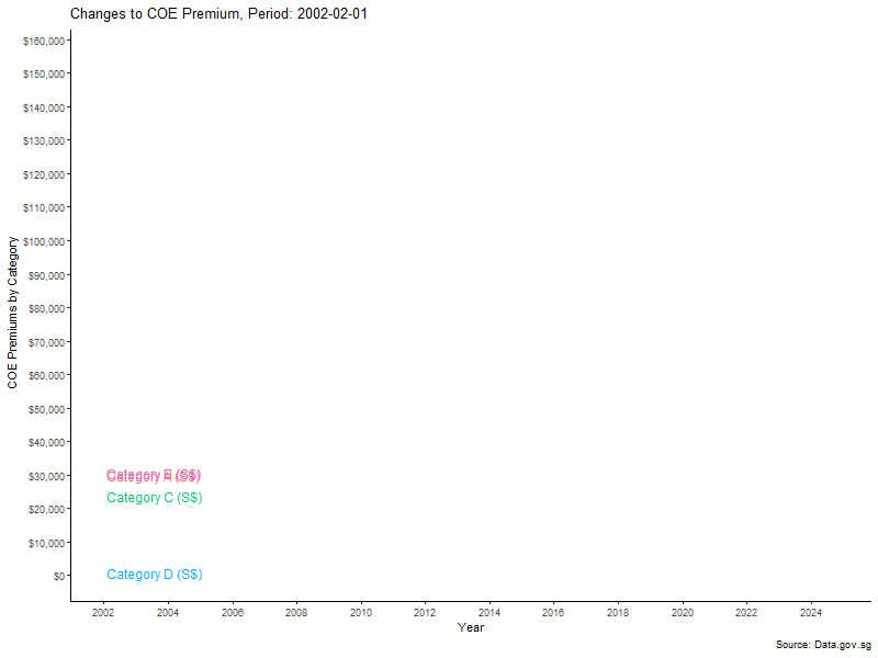
The gg animation depicts changes to the monthly COE premium result for all five vehicle categories between January 2002 and October 2024.
Throughout the years, COE premium has experienced various fluctuations, with Category E (open category) consistently being the most expensive certificate to own. Additionally, two significant bullish runs were noted, with the former being post-global financial crisis from 2009 to 2013, with the latter being post COVID-19 pandemic from 2021 to present.
The supply of COEs is primarily driven by policy changes. For instance, after the first bullish run, COE premiums dipped due to batches of cars being deregistered. However, supply was artificially reduced following Government’s announcement of a zero-growth rate policy in February 2018, leading to a rise in COE premiums. On the flip side, demand for COEs is influenced by individual wealth and consumer spending power, coupled with available supply in the market, where COE premiums tend to spike whenever there is a shrink in supply.
Barring the separate discussion on low interest rates and car dealerships in my previous post, this animation essentially paints a story on natural market forces of supply and demand to vehicles over time.
Data Appendix
1
2
3
4
5
6
7
8
9
10
11
12
13
14
15
16
17
18
19
20
21
22
23
24
25
26
27
28
29
## Load relevant packages
library(gganimate) # Load 'gganimate' package.
library(gifski) # Load 'gifski' package.

## Setup ggplot function
COE.Premium.Plot.2 <- filter(COE_Mutate, `Data Series` %in% c("Category A (S$)", "Category B (S$)", "Category C (S$)",
                                                              "Category D (S$)", "Category E (S$)")) %>%
  ggplot(aes(x = Period, y = Value, group = `Data Series`)) +
  geom_line(aes(color = `Data Series`), size = 1.1) + # Adjusting size to make lines thicker.
  labs(y = "COE Premiums by Category", x = "Year",
       title = "Changes to COE Premium, Period: {frame_along}",
       caption = "Source: Data.gov.sg") +
  scale_y_continuous(labels = scales::dollar, breaks = seq(0, 160000, by = 10000)) + # Adding formatting to y-axis with currency.
  scale_x_date(date_breaks = "1 year", date_labels = "%y") + # Adding formatting to x-axis to declutter number of years shown.
  theme(axis.title = element_text(size = 14),
        axis.text.x = element_text(size = 14),
        plot.title = element_text(size = 20, face = "bold", hjust = 0.5)) +
  theme_classic() +
  geom_dl(aes(label= `Data Series`, color = `Data Series`),
          method = "last.points") +
  guides(color = "none") +
  transition_reveal(Period) # Adding gganimate transition

## Check plotting
COE.Premium.Plot.2

## Saving the animation as .gif file
animate(COE.Premium.Plot.2, nframes = 200, fps = 10, width = 800, height = 600,
        renderer = gifski_renderer("COE_Premium_Animation.gif"))